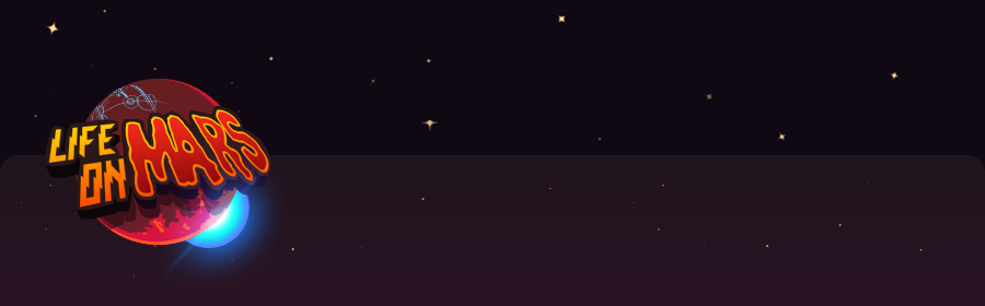
I am here to talk a little about the concept and design of our user interface.
In the beginning we basically had 3 premises:
1. Keep it simple/lightweight.
2. Keep the loading times out.
3. Keep it as aspect ratio independent as possible.
Simplicity
What I mean with "lightwight is quite easy to explain: To design a user interface that keeps the impact on memory and performance of a mobile device to a minimum. Our solution to the problem is fairly simple; We decided to make our interface 2.5D and keep the texture requirements low.
That means all the assets are actually build in a 3D software package but rendered to an orthogonal camera which essentially displays everything in a 2D fashion with 1:1 pixel/texel ratio, so we won't have to deal with distortion of our imagery. To minimise memory usage I tried to use as many flat coloured polygonal shapes that were given a small 16x16 pixel square on the texture atlas.
The only reason why I did not get away with just one 256x128 pixel texture for our UI is that I decided to display our logo in a rather large scale, and I ended up with a 512x512 pixel texture. Using only one texture for the whole UI helps in a few ways to get rid of the memory overhead which Unity's native UI system would normally suffer from.
I'll give you a short explanation why that happens. All 2D images or textures in every game using hardware acceleration through the GPU need to use a "power of two" edge length; Meaning every texture has to have a width and height being a multiple of two (eg. 8x8, 32x32, 256x128).
So where is the downside? Well, for now Unity forces the developers who decide to use their build in user interface framework, to use a separate texture for each and every interface element, such as button, labels, text boxes or toggle buttons; and they all have to be a "power of two" texture, which might not be the case for it's original design; Maybe you chose to have an icon being 80x80, which would mean you'd either have to use padding to get to the 128x128 pixels or make the texture 64x64 and scale it up. This of course, will lower your UI quality a lot.
You might say: "But Unity lets me import non-"power of two" textures!". You are right about the importing part, but if you check the texture in the asset viewer it will still claim "not pow2" and rescale the texture to be "power of two" when you export it - that's not Unity's fault, it's just how GPUs expect their textures.
Secondly and even more important, Unity will never scale your image down, even if your icon is close to the lower power of two, eg. 65x65 pixels; This one will be scaled up to a whopping 128x128 pixels. With a single atlas that contains all the parts of your UI, you can see into it, that all elements get their space; Without wasting to much of the texture with blank areas which won't be used at all. I've made a little graphic to illustrate this a little better.

comparing choices for UI textures with Unity's UI framework.
Since we didn't need all the various base components unity offers with their framework, we build our own structure for the UI, so I can have full control over the texture sizes. It also gives me full control over the animation part of the UI without touching any code in Unity, which is much faster to handle when it comes to iterations and adjustments.
So enough talk, let the images speak, all the texture space we need for our menus is what you see in the example down below! Also I've whipped up a little animated GIF to show you how the menus are generally layered.

the texture atlas is displayed scaled, it is actually 512x512px in size.

perspective and orthogonal view of the main menu layers. click it! it's animated!
What I mentioned above brings me to another aspect of "simplicity" and how easy it is for both programmers and artists to work with those menus. In case you decided to animate your menu you will be needing at least 3 animations per menu ("in", "loop" and "out" animations); If it is a complex menu, there might be even more. Fortunately it is really easy to import fbx files in Unity and make them start/stop or loop a certain section of the included animation, so for us this was the way to go.
Loading...
I think most people dislike loading times and even though they are sometimes necessary, I agree with them, loading times can be quite annoying.
So for we thought: "Wouldn't it be cool to press "start game" and the darn game really starts?!". This kind of stuck with us and I think we managed to find a way to get this done. As you might have noticed in the picture above, the menu resembles a futuristic airlock. So once you press that button, it opens and the game starts, no catch, nothing holding it back; It just starts.
It is the same way round when the game ends; You're presented with a result screen which will show how well you did - once you decide to hit the "continue" button, the results screen will animate off screen while the main menu comes in with a "closing door" animation. So you see no unpleasently long and boring transitions between the game's states, which I hope you'll dig as much as we do!
Hey, why is there a gap?
There is always a number of problems you run into when you make a game for several target devices with different display resolutions and aspect ratios. Some are quite easy to evade, some are not. In my professional career, I came across quite a few people who were of the opinion there is a easy solution to a "one size fits all" UI.
The more complex your interface is, the harder it gets to get it right for everyone and everything. The sad truth in fact is, while you can minimise negative effects and drawbacks of different resolutions with a dynamic, scalable user interface, there are always some unwelcome guests you have to let "stay" if you choose this path.
First of all the time it takes to properly set up a dynamic system takes a lot of manpower both in the coding and art department but that still won't give you optimal results for all aspects when creation a more complicated and information heavy interface. Secondly it might warp the imagery and or the white space between elements, thus rendering the solution inadequate or unusable in the worst case, because it might look a little too crowded.
This is yet another reason why we pleaded to the creed: keep it simple! It'll be much more likely to hit the jackpot for a "as close as possible solution" - but don't expect it to work for another project, it might if it's the same target device(s), but don't depend on it; UIs are the most contextual things when it comes to software development.
The sooner you make up your mind about this and the actual requirements for your interface, the better, cleaner and more ergonomic it will be. Don't hesitate to write up what you expect your interface to convey, where and what to to display and how you want the user to benefit with this information. Try to come up with solutions to maximise its size without getting in the way of the game or hitting a physical barrier like the good old memory constraints. Another thing I recommend to everyone making a UI is to talk to people about it; Let them have a look at it or them try it out. They don't have to be into design, just let them look at your ideas, most of the time you will get valuable feedback. Remember it's not you using this interface, it's everybody else and they have to be able to use it!
To get back to the topic of resolution independence, the solution we chose is far more manageable and clean in terms of its look and the time it takes to integrate it into the game then most other projects I worked on. Due to the 2.5D nature of our UI all we need to do is set a scaling value based off the height of the devices display and give the menu enough "meat" around the edges so nothing will flash through unwanted gaps, this will keep everything neat and tidy with a super minimal hit on man power (around a few minutes of added work at max for all the menus combined)
So our drawback here is we can't make it a lot more complicated than it already is, but for now, that exactly fits our needs, so we're fine with that!
So I guess that's all I have to say for today, but I won't leave you with nothing, so here's a bonus; one of our menu transitions from our main menu to the high scores.
Thanks for your time!
cheers
Oliver


